Tokens Guide and Examples
Guide
Which token to use
Semantic naming of Alias tokens helps associate meaning, context, and/or intent with the design markup you apply to your product.Whenever possible, use alias token instead of using basic token and hex color directly.
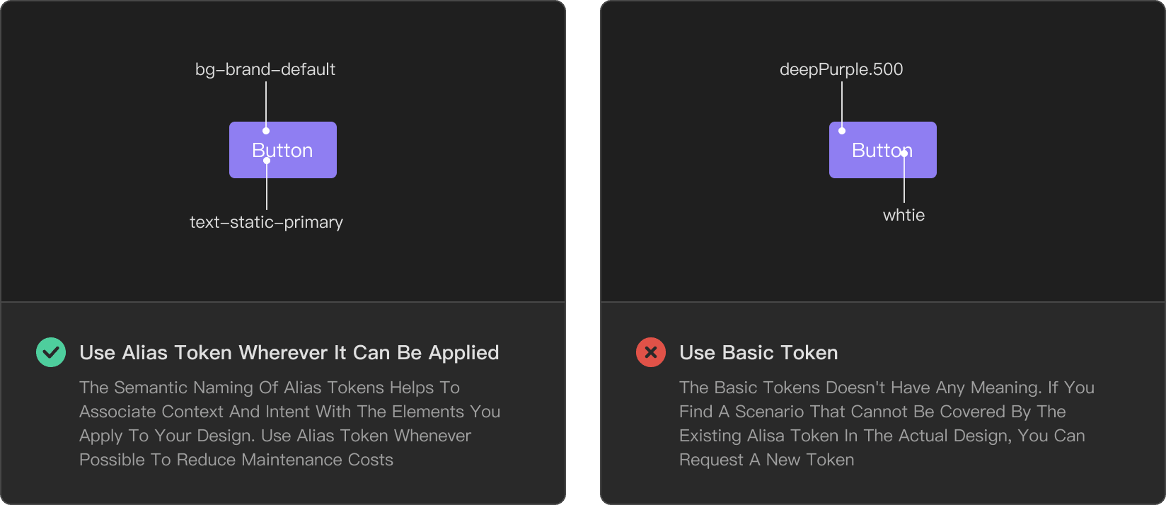
Use the corresponding token
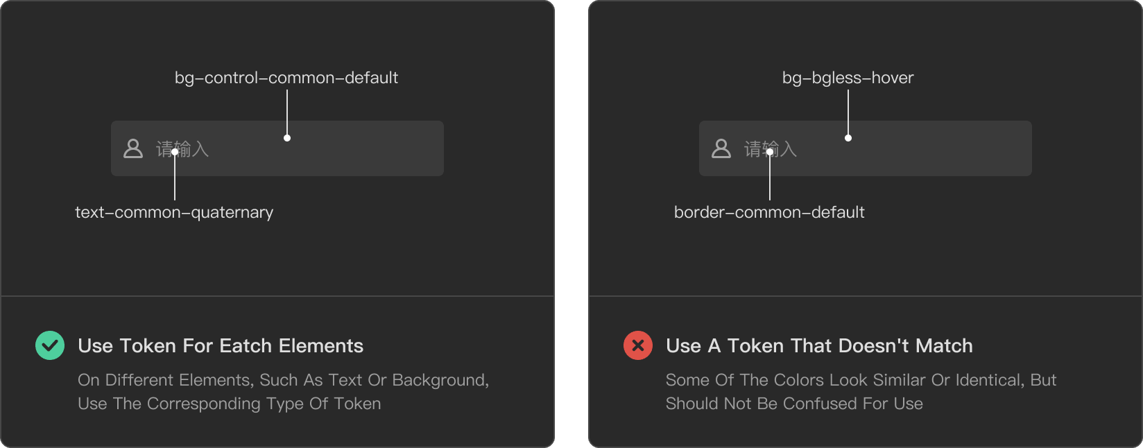
Use Cases
Fonts
General Text
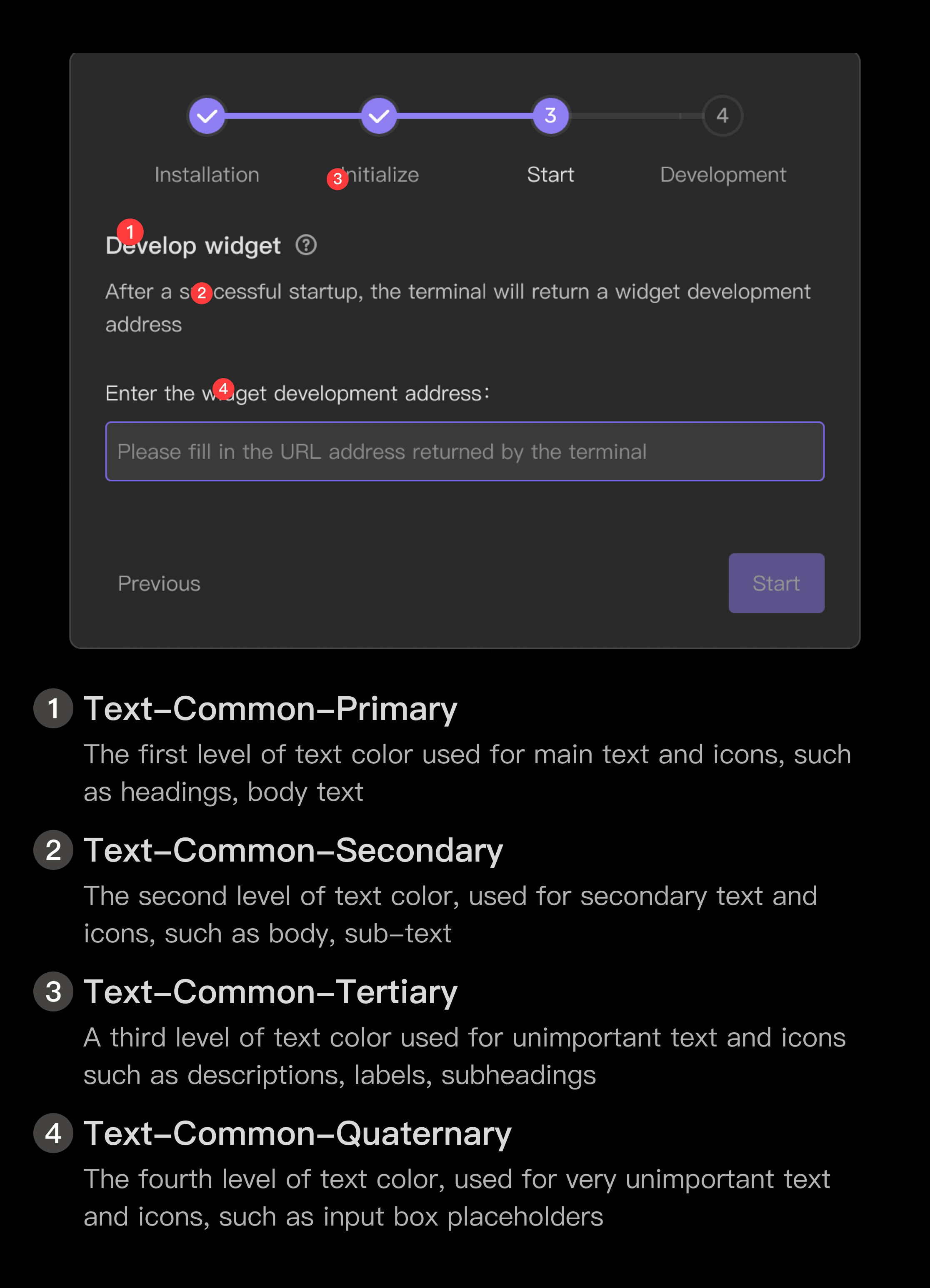
- Text-Common-Primary The first level of text color for primary text and icons, such as headings, body text, etc..
- Text-Common-Secondary The second level of text color for secondary text and icons, such as body text, secondary text, etc..
- Text-Common-Tertiary The third level of text color for unimportant text and icons, such as descriptions, labels, subheadings, etc..
- Text-Common-Quaternary Fourth-level text color for very unimportant text and icons, such as input box placeholders, etc.
Link color text and status color text
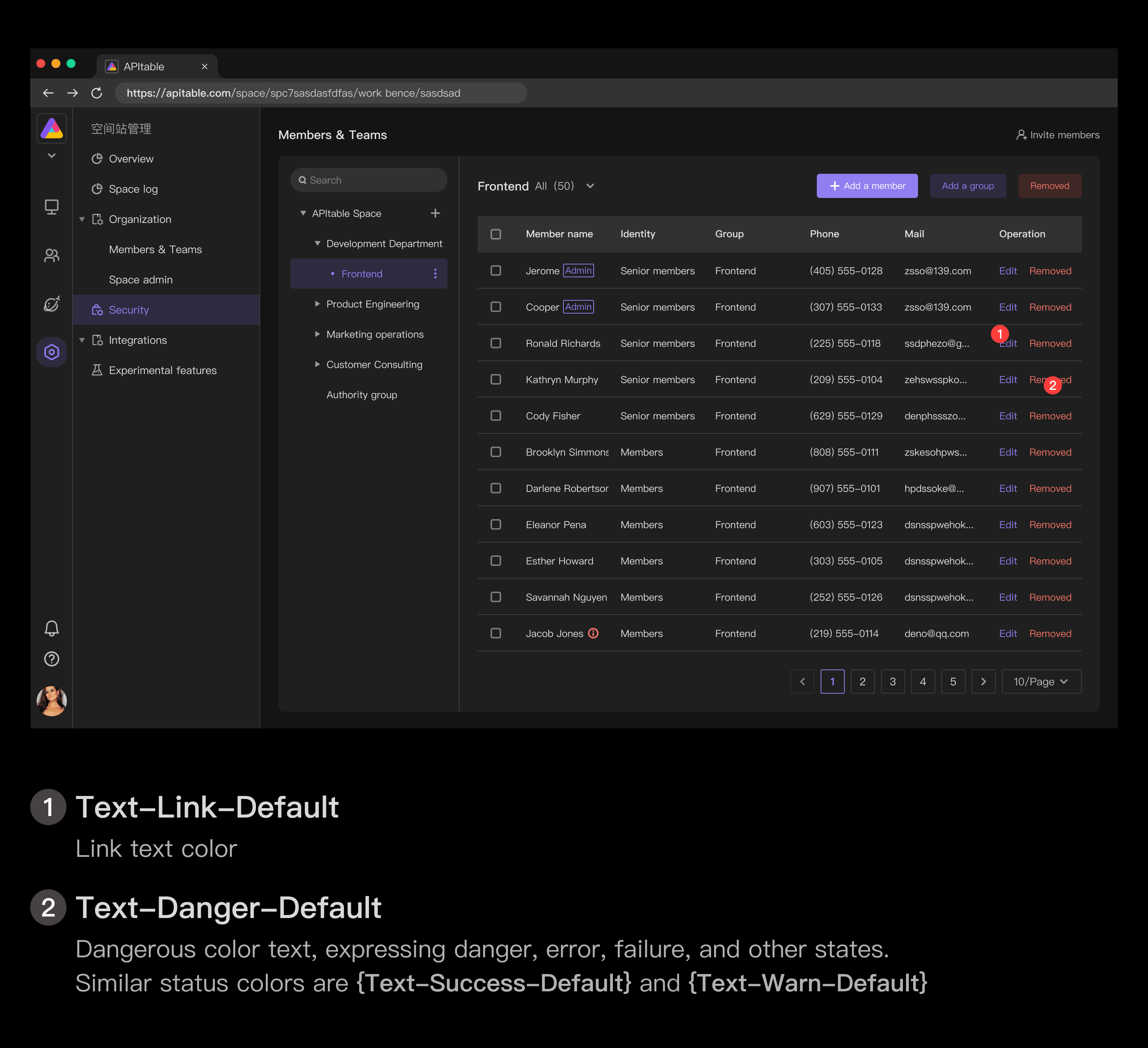
- Text-Link-Default Link Text Color
- Text-Danger-Default The text color of danger, expressing the state of danger, error, failure, etc.
- Text-Success-Default is a text color that expresses the status of success, safety, correctness, completion, etc.
- Text-Warn-Default The text color of the warning color, expressing the state of alert, warning, unsafe, etc.
Fixed color text
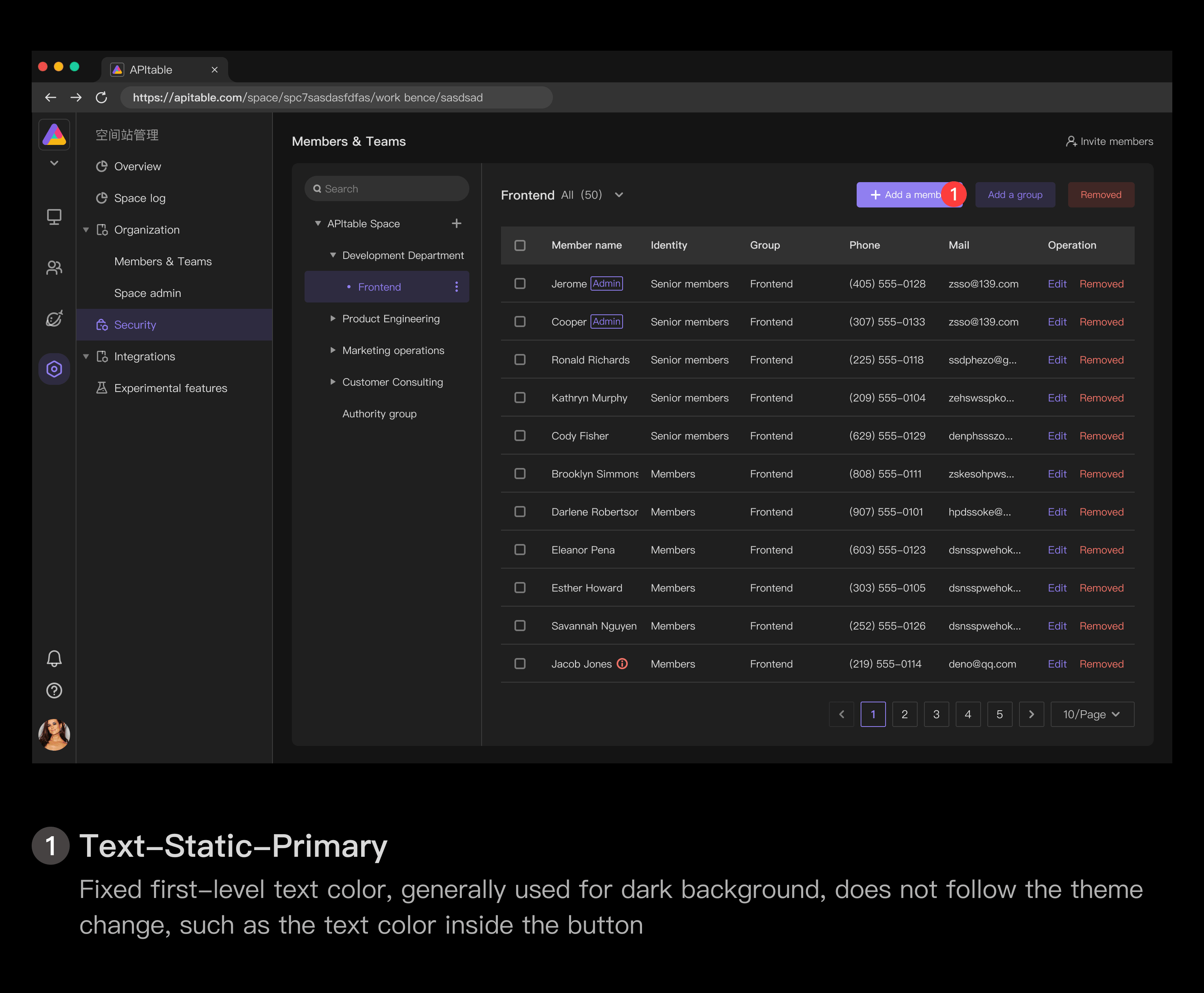
Text-Static-Primary fixed first-level text color, generally used for dark background, does not follow the theme change, such as the text color inside the button
Background
General Background
- Bg-Common-Lower The background color of the lowest level
- Bg-Common-Default The background color of the medium level, which is used by default
- Bg-Common-High higher-level background color, usually used for the background of the floating layer above Bg-Common-Default
- Bg-Common-Highest Top-level background color, typically used for drop-down/right-click menus, notification alerts, unmasked modal windows, etc.
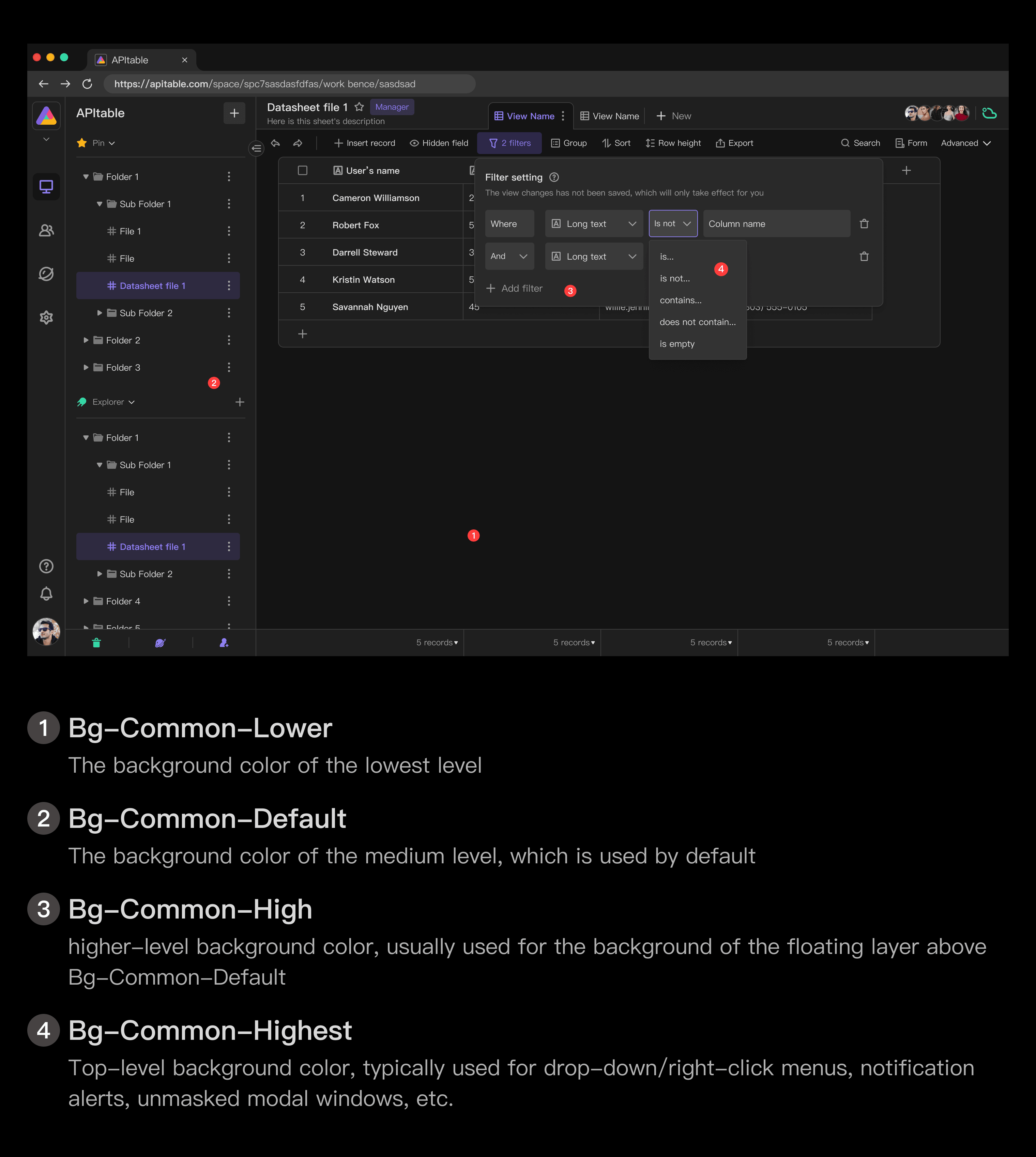
Simply put, the background color defaults to Bg-Common-Default and uses that as the hierarchical base.Bg-Common-Lowest if you need to use the bottom level, Bg-Common-High if you need some prominent level or hover over Default, and Bg-Common-Highest if you need high attention for various temporary operations such as drop-down menus, notification alerts, and bubble alerts.
Control Background
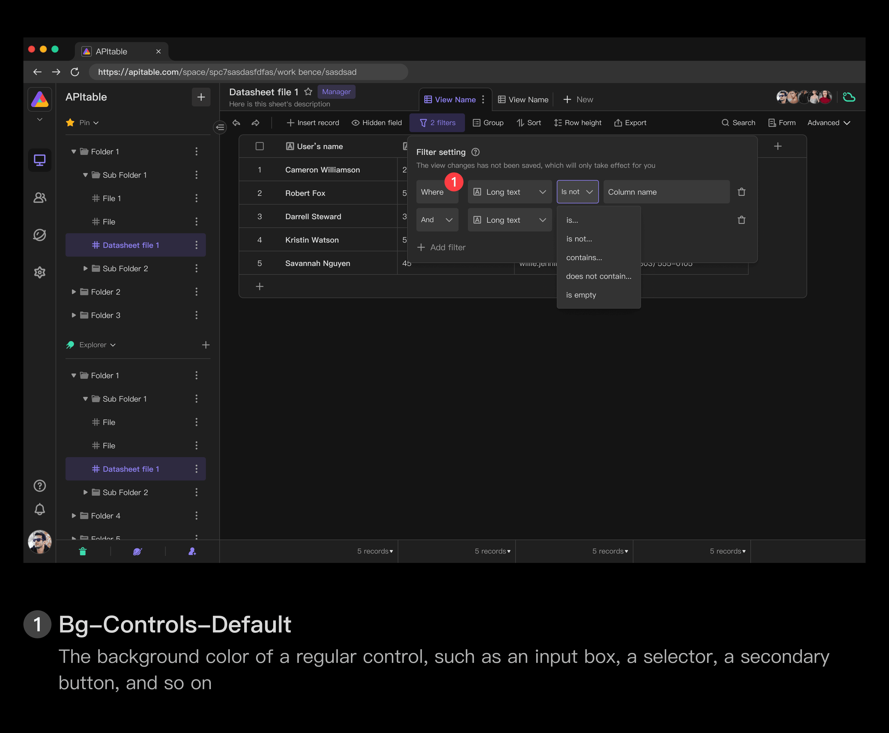
- Background color for Bg-Controls-Common-Default regular controls, such as input boxes, selectors, secondary buttons, etc.
- Bg-Controls-Common-Hover hover state for the background color of regular controls, such as input boxes, selectors, secondary buttons, etc.
- Background color for Bg-Controls-Common-Default regular controls, such as input boxes, selectors, secondary buttons, etc.
Interactive state without background elements
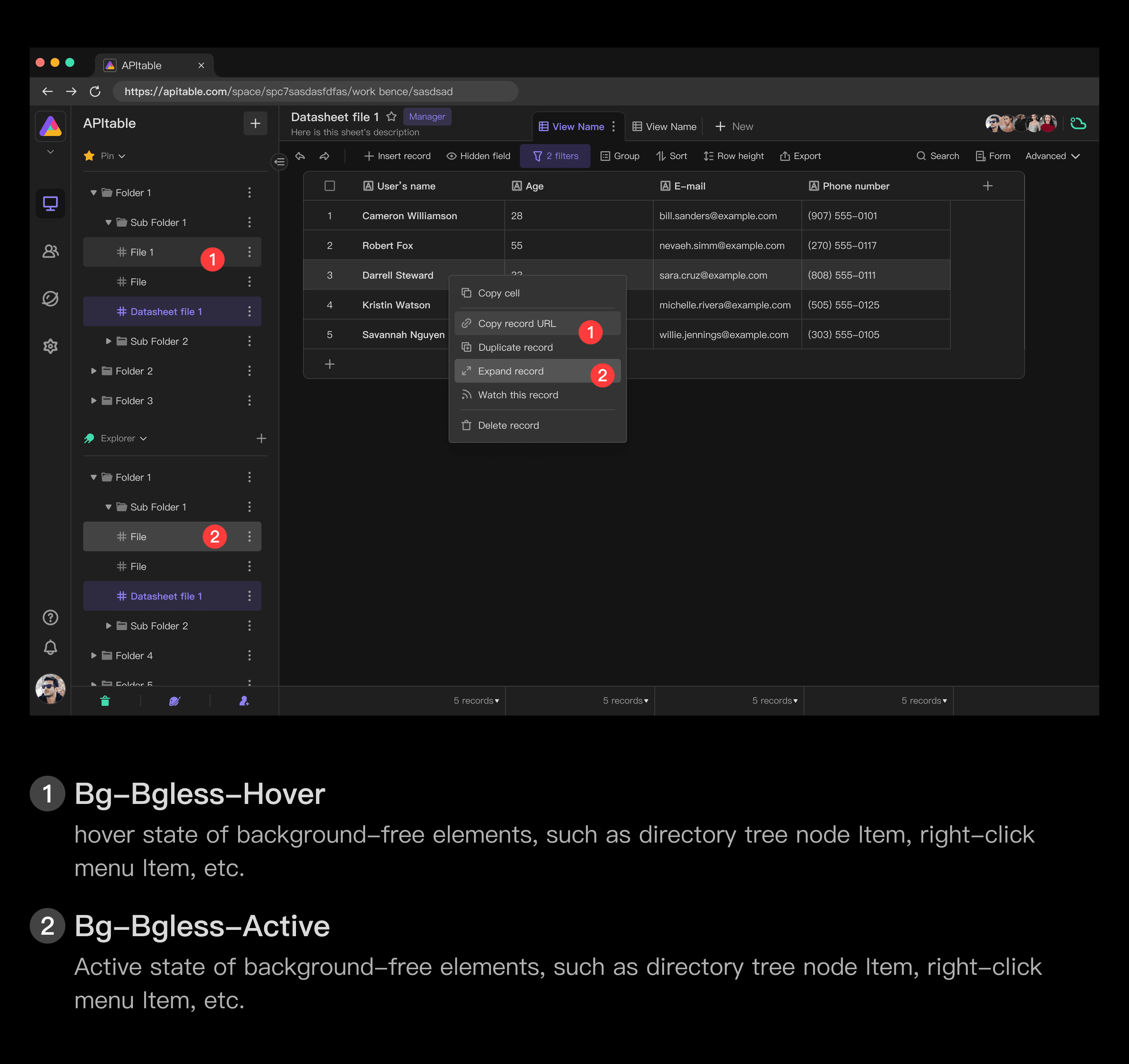
- Bg-Bgless-Hover hover state of background-free elements, such as directory tree node Item, right-click menu Item, etc.
- Bg-Bgless-Active active state of background-free elements, such as directory tree node Item, right-click menu Item, etc.
Opposite color
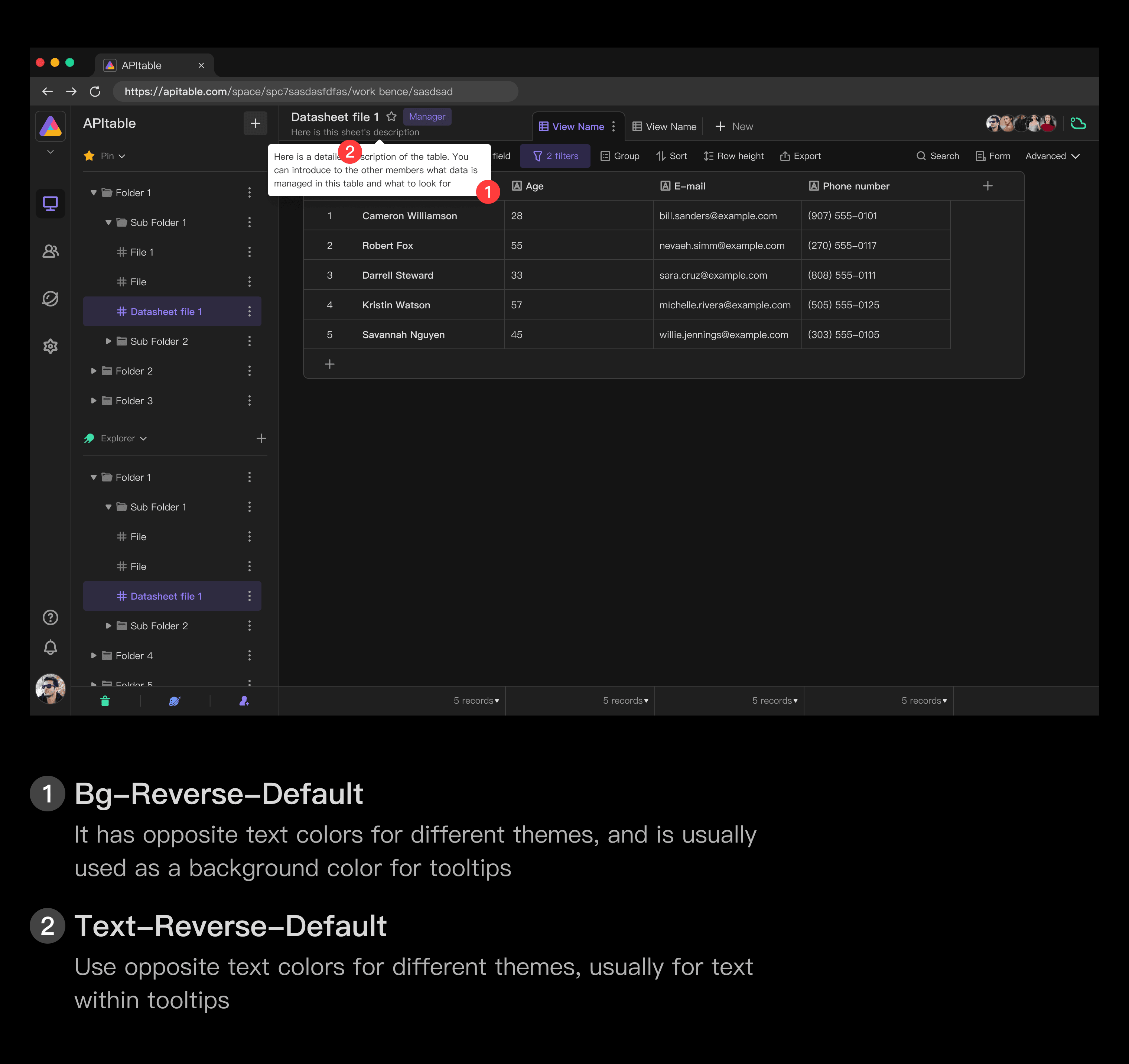
- Bg-Reverse-Default is the opposite background color in different themes, usually used for tooltips background color
- Text-Reverse-Default is the opposite text color in different themes, usually used for text within tooltips
In some cases, it can be useful to apply a light component to a dark background or a dark component to a light background.This helps to gain the user's attention or create visual tension.In this case, the token of the opposite color can be used.
Stroke
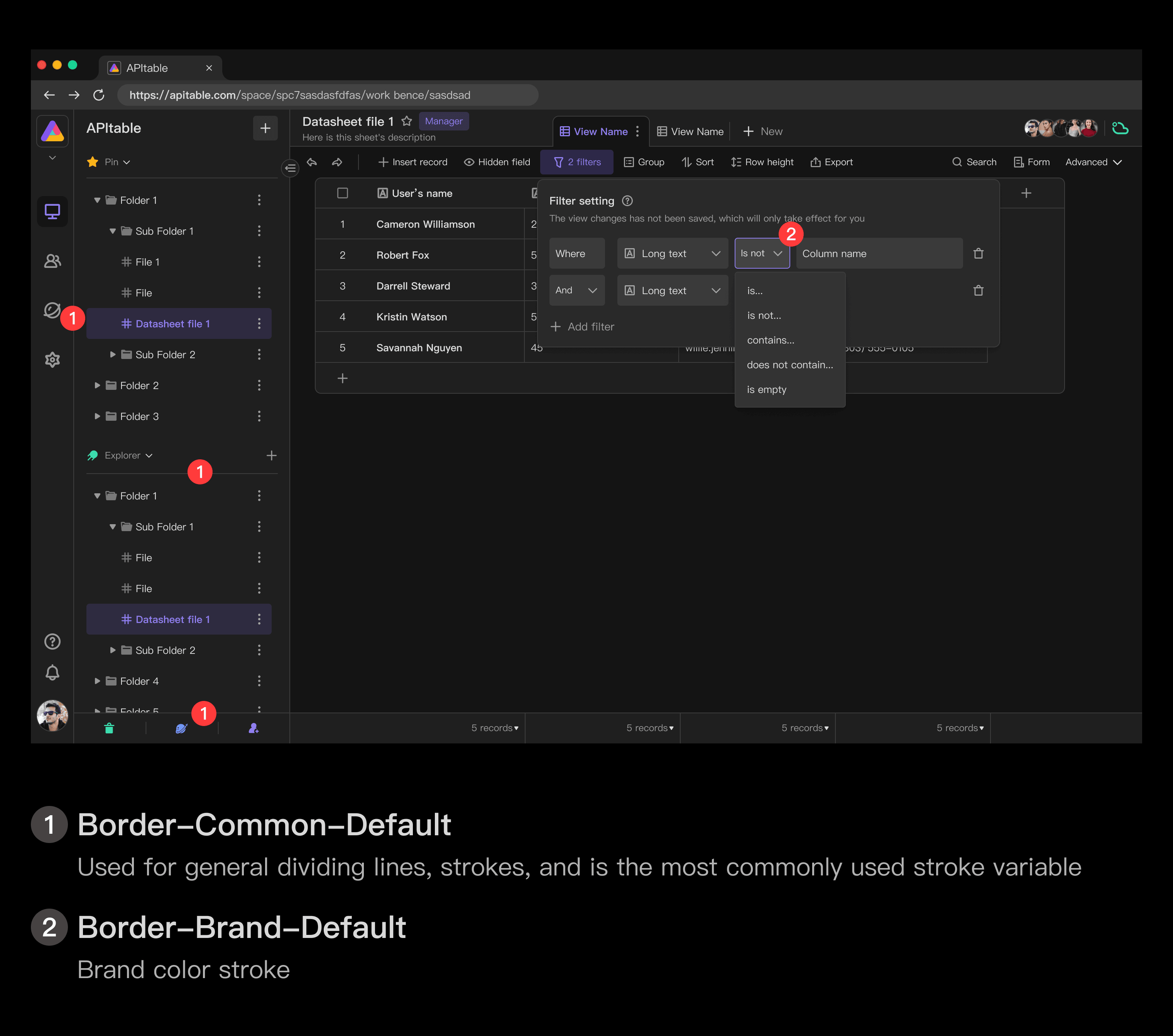
- Border-Common-Default is used for general dividing lines, strokes, and is the most commonly used stroke variable
- Border-Brand-Default brand color stroke
Projection
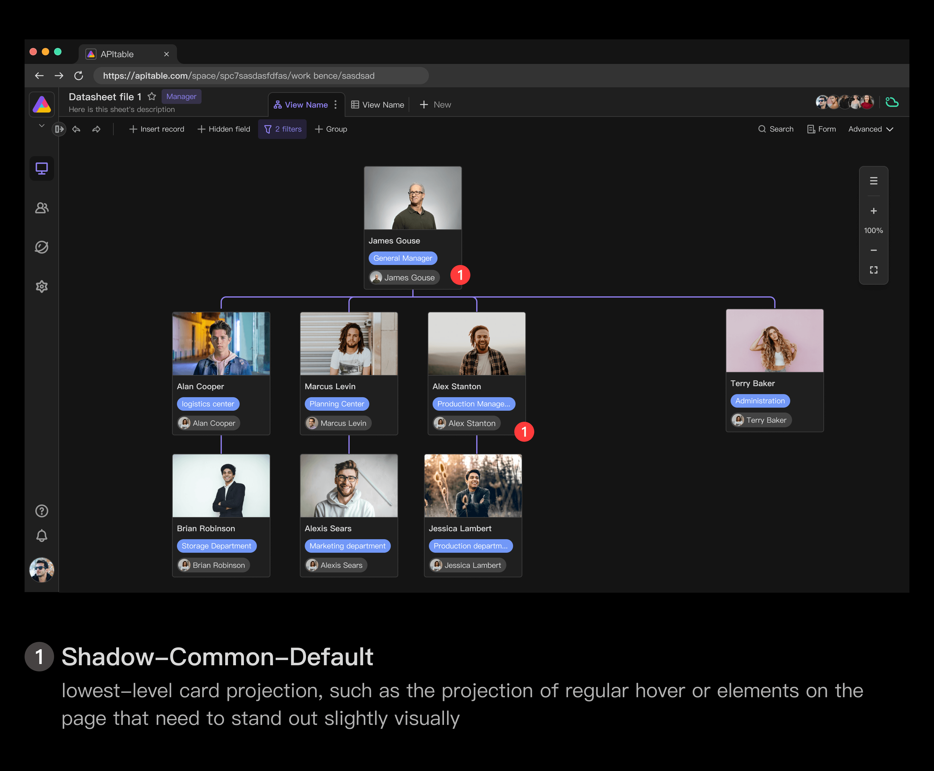
Shadow-Common-Default lowest-level card projection, such as the projection of regular hover or elements on the page that need to stand out slightly visually
Shadow-Common-High medium-level card projection, such as temporary floating layers on the page, projection of an unmasked Modal
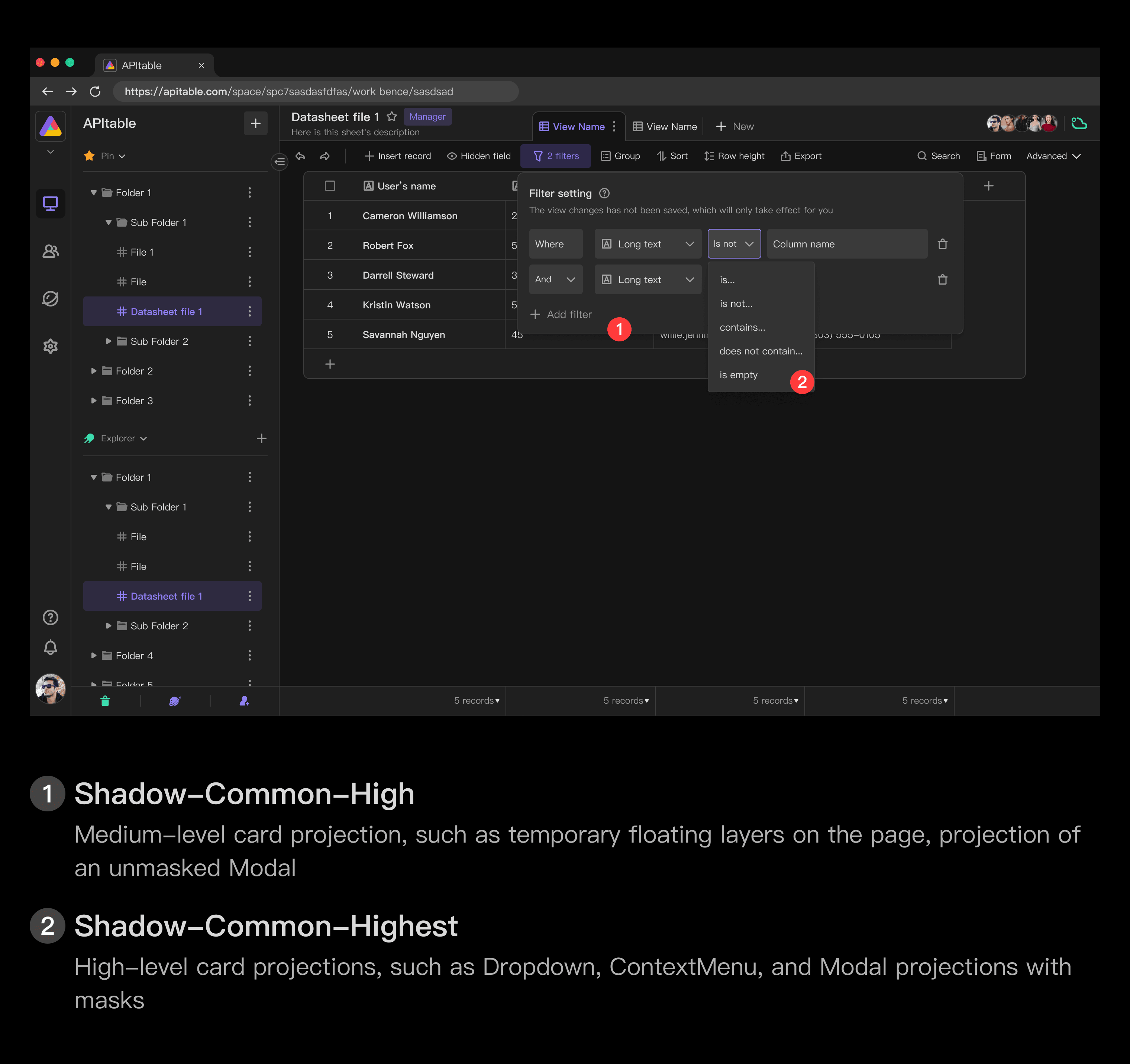
Shadow-Common-Highest High-level card projections, such as Dropdown, ContextMenu, and Modal projections with masks
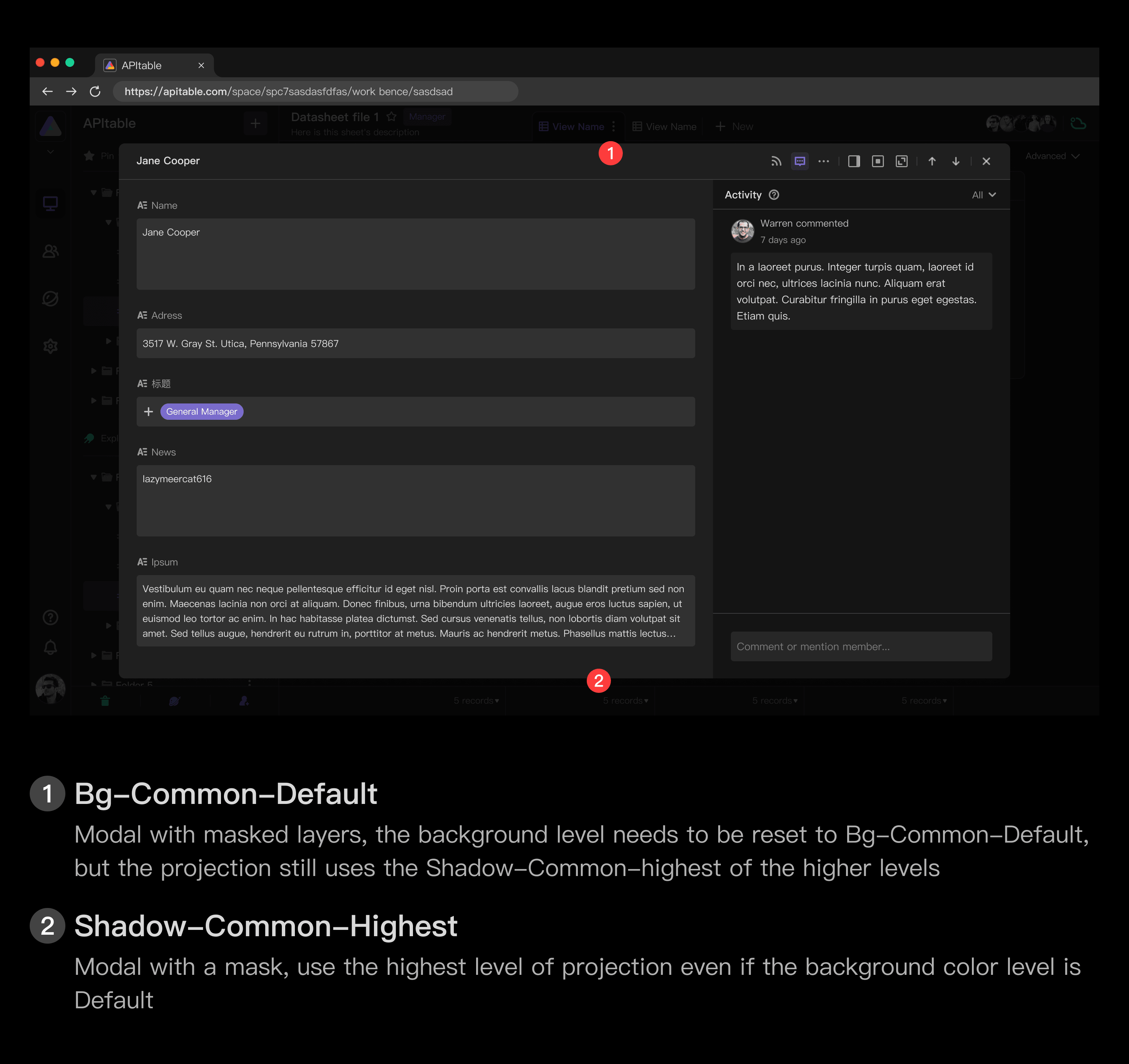
In general, the projection is related to the background level:
- Shadow-Common-Default corresponds to the background Bg-Common-Default
- Shadow-Common-High Corresponds to the background Bg-Common-High
- Shadow-Common-Highest corresponds to the background Bg-Common-Highest
However, in Modal with masked layers, the background level needs to be reset to Bg-Common-Default, but the projection still uses the Shadow-Common-highest of the higher levels