Support dark mode
The widget supports dark theme now.Support switching themes by default following the main app.Support two ways to handle the style of multiple themes (default theme, dark theme).
Using CSS Variables
Refer to How to use css to configure the widget to support css.Use the css variables formatted in Design tokens provided by the AITable design team in css (different color schemes for different themes).
Using in the style file
Use as follows.
.list {
  color: var(--fc1);
  box-shadow: var(--shadowCommonShadow2);
  background-color: var(--bgCommonDefault);
}
Debugging with the browser
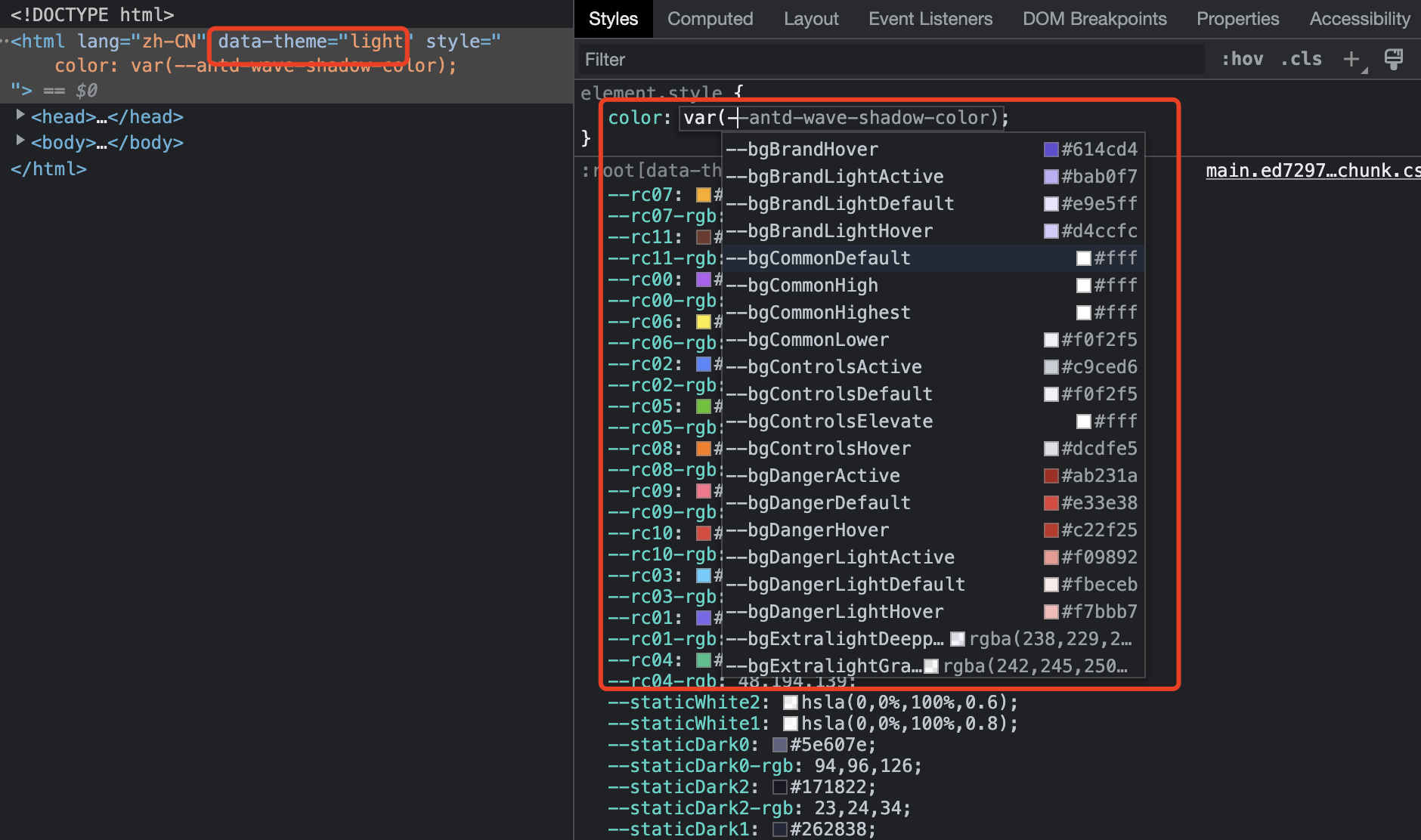
In Google Chrome Console css variables will be prompted with a list of tokens corresponding to your current theme.
Using in inline styles
You can also use the colorVars object in the component library @apitable/components to automatically adapt the theme, write it with Typescript type hint variables, or of course write the css variables by hand in string format (not recommended).
import { colorVars } from '@apitable/components';

export const HelloWorld = () => {
  return (
     <span style={{
      color: colorVars.textCommonPrimary,
      background-color: 'var(--bgCommonDefault)';
    }}>
      Hello World
    </span>
  )
}
Customize css variables
You can customize css variables to fit multiple themes, create a new variables.css file to manage custom css variables:
:root[data-theme="light"] {
  --custom-variables: xxx;
}
:root[data-theme="dark"] {
  --custom-variables: xxx;
}
ThemeProvider
Get color variables with hooks
The widget has been wrapped by default by the ThemeProvider component, which already supports changing themes following the main application theme.Use the useTheme hooks of @apitable/components to get the colors.
import { useTheme } from "@apitable/components";

export const HelloWorld = () => {
  const theme = useTheme();
  return (
    <span style={{ color: theme.color.textCommonPrimary }}>Hello World</span>
  );
};
Get theme information
Information on the current topic can be obtained using useMeta.
import { useMeta } from "@apitable/widget-sdk";

const meta = useMeta();

const theme = meta.theme;